Visual design is much more than making things look pretty, it’s about crafting experiences that connect, engage, and influence. Whether you are creating a brand identity, a mobile app interface, or a social media campaign, understanding the fundamentals of visual design can make your work stand out in a competitive industry. This blog post will walk you through ten timeless principles every visual designer should know, helping you create designs that are not only aesthetically pleasing but also functional and impactful.
Introduction
In the evolving world of design, mastering the core principles is essential for anyone aspiring to create powerful, meaningful visuals. Enrolling in a visual design course can equip you with the knowledge, tools, and techniques to apply these principles effectively in real-world projects. From balance and contrast to hierarchy and alignment, these principles form the backbone of any successful design.
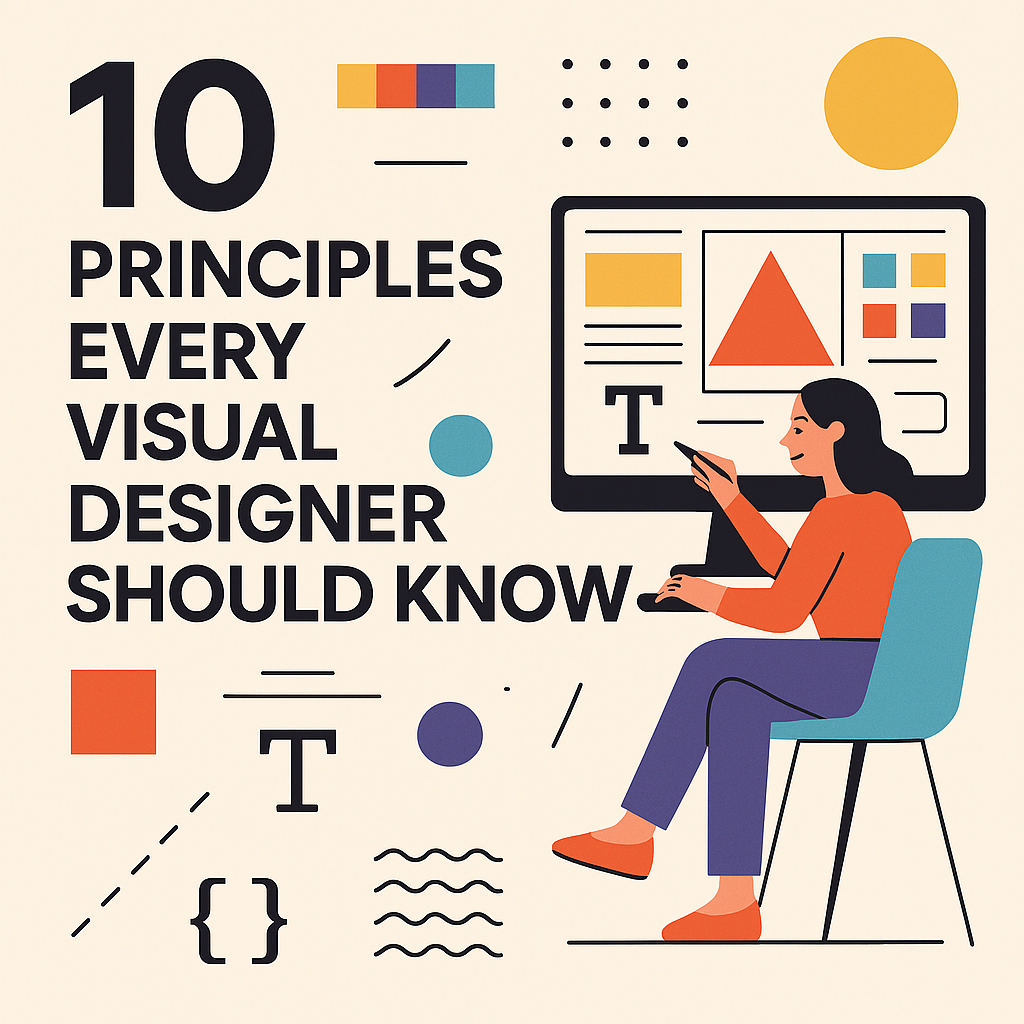
10 Principles Every Visual Designer Should Know
1. Balance
Balance refers to the distribution of visual weight within a design. It ensures that no single part overwhelms the whole.
- Symmetrical balance offers a formal, traditional look.
- Asymmetrical balance provides a modern, dynamic feel.
2. Contrast
Contrast highlights the differences between elements, making designs more engaging. This can be achieved through color, size, shape, or texture.
- Use light vs. dark colors to create depth.
- Pair serif and sans-serif fonts for typographic variety.
3. Alignment
Alignment creates a visual connection between elements, ensuring the design looks organized and polished.
- Use grids for precise alignment.
- Maintain consistent spacing for a clean layout.
4. Hierarchy
Visual hierarchy guides the viewer’s eye to the most important elements first.
- Make headings larger and bolder.
- Use contrasting colors for key elements like buttons or CTAs.
5. Repetition
Repetition builds unity and consistency across a design.
- Repeat fonts, colors, and shapes throughout your layout.
- Use recurring patterns for brand recognition.
6. Proximity
Grouping related elements together improves readability and creates clear relationships.
- Keep related content close together.
- Avoid clutter by separating unrelated information.
7. White Space (Negative Space)
White space is the breathing room between elements, enhancing clarity and focus.
- Use it to highlight important content.
- Avoid overcrowding the design.
8. Color Theory
Colors influence emotions and perceptions. Understanding color theory helps you choose palettes that convey the right message.
- Warm colors create energy.
- Cool colors evoke calmness and trust.
9. Typography
Typography impacts readability and tone. Good typography ensures your message is clear and aligned with your brand’s personality.
- Limit your design to 2–3 fonts.
- Ensure font sizes are appropriate for hierarchy and readability.
10. Accessibility
Accessibility ensures your design is usable for everyone, including those with disabilities.
- Use sufficient contrast for readability.
- Include alt text for images and make interactive elements keyboard-friendly.
Quick Tips for Applying These Principles
- Plan before you design – Sketch layouts before jumping into software.
- Test your design – Gather feedback and iterate.
- Stay updated – Follow industry trends, but never compromise on fundamentals.
Conclusion
Mastering these ten principles can elevate your work from average to outstanding, enabling you to create visuals that truly resonate with your audience. Many aspiring designers hesitate because they believe design is purely about innate talent, but in reality, these principles are skills you can learn and perfect. Programs like the IIT design course blend theoretical knowledge with practical application, helping you develop a professional design mindset and the ability to apply these fundamentals in diverse scenarios.
As design legend Paul Rand once said, “Design is the silent ambassador of your brand.” Whether you are crafting a simple poster or a complex user interface, applying these principles ensures your designs speak clearly, effectively, and beautifully.